
Pandemic Reveals New Potential for Data and Analytics
COVID-19 has fueled, among many things, a hefty appetite for data and analytics.
Having witnessed a rapid-fire evolution from a few, isolated cases in another corner of the world, to a pandemic that has the globe in its grips, data visualizations are now helping to tell the story and reveal the kinds of big data insights that are now possible.
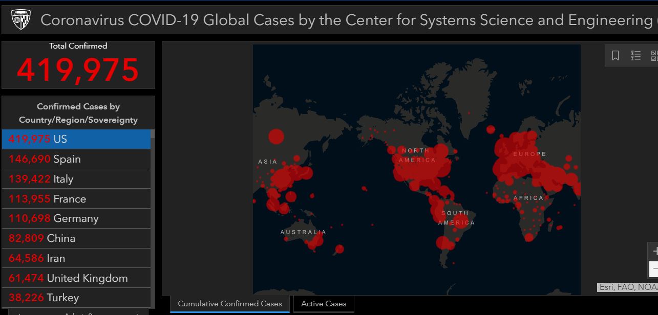
Near the top of the list of data visualizations that are providing an updated perspective on the Coronavirus is the Johns Hopkins University interactive global map, which offers a global view of the pandemic, along with the ability to drill down for a closer look at the spread of the virus within specific countries and regions.
Johns Hopkins University COVID-19 Map
Tracking Movement Via Cell Phone Data
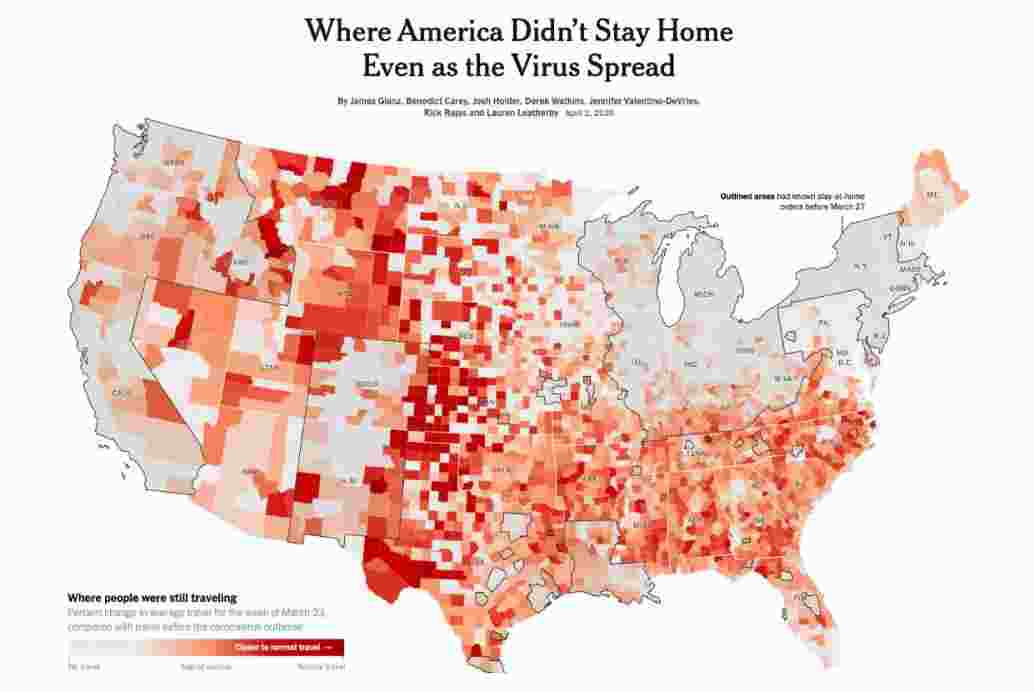
An April 2, 2020 article in an online edition of The New York Times offered another angle from which to view the response to the Coronavirus in the United States.
Using mobile phone GPS data, a color-coded map of every county in the United States, depicted miles traveled for the week of March 23, as an indicator of the degree to which people were adhering to shelter-in-place recommendations or orders.
Modeling Steps to Curtail the Spread
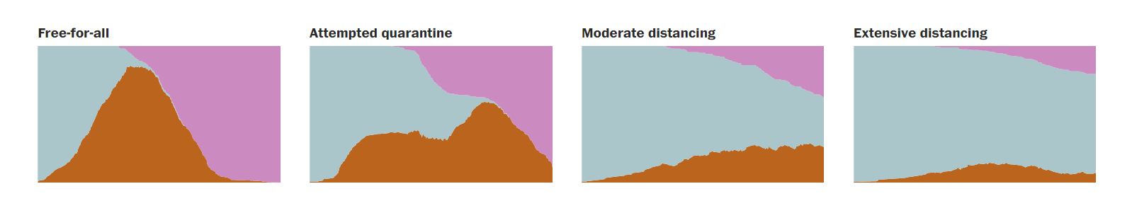
This third example is from a March 14, 2020 article in an online edition of the Washington Post, designed to demonstrate the impact of various degrees of social distancing.
The article entitled, “Why outbreaks like coronavirus spread exponentially, and how to ‘flatten the curve,’” included animations of dots that demonstrated the impact of various levels of human contact on the spread of a hypothetical virus.
Untapped Potential
While big data is fueling insights, that would have been difficult to fathom as recently as a decade ago, a depth and breadth of analytics and actionable data are within closer reach than many realize.
Potentially rich data sources that too often go underutilized include:
- Google analytics,
- A/B testing,
- Sales tracking,
- Live chat,
- Customer surveys,
- Heat mapping of visitors’ website activity,
- Competitor assessments,
- Usability testing, and
- User interviews.
At Promet Source, we are passionate about helping clients to uncover and unlock the full potential of their data and analytics. We are also experts at creative visualization strategies that help clients and constituents to clarify complexities and understand information from new angles.
Interested in igniting new data- and analytics-driven possibilities? Contact us today.


