What Makes a Great Government Website?

More so than ever before, the public sector is relying on websites to handle a depth and breadth of heavy lifting —serving as a central information hub, providing a venue for taking care of official business, advancing civic pride, alerting citizens to weather and public health emergencies, and a lot more.
Covid-19 sharpened the focus on the importance of government websites being able to step up and multi-task. That trend is shows no signs of reversing.
Essential objectives for government sites share much in common with private sector sites—easy navigation, robust search capabilities, and a consistent application of design elements—but in the current environment, government websites present distinct challenges and opportunities.
Drupal for Government
Leveraging the power of Drupal to design and develop expectation-exceeding websites for public sector clients at every level, we at Promet Source have honed a distinct expertise in the build of government sites that can function on many levels.
The process begins with a true understanding of the evolving role of public sector websites and the value of an open source CMS, followed by a commitment to diligent discovery and active listening to the needs to stakeholders.
Here are the top five factors that we’ve identified as the essential differentiators between government and private sector sites.
1. Public sector sites need to serve every demographic group.
While the targeted niche for a private sector site often encompasses a wide spectrum, government sites, have an inherent need to serve everyone. Creating web experiences that appeal to and accommodate the user journeys and needs of every age group, education level, income level, and comfort zone with technology, as well as people with disabilities, requires a significant balancing act.
An in-depth discovery process is required to set the stage for a successful outcome. Adept information architecture skills also very much come into play in the process of creating a user experience that streamlines navigation and simplifies access to a wide and disparate range of information and resources for the full spectrum of users.
And easy navigation is just the start. Public sector sites also need to be engaging, reassuring, familiar, service oriented, and always aim for a subtle "WOW!-that-was-easy" factor.
2. Community building is a core objective.
In many respects, government sites are now serving as a virtual town square—the place where connections are made, information is exchanged, essential tasks are completed, and messages concerning what sets the community apart and what it stands for are reinforced.
While private sector sites tend are likely to have one, clearly defined and singularly focused mission, the success of government sites hinges on multiple factors.
The design of a government website needs to account for the likelihood that it might be visited and viewed simply for purposes of checking in, and that the content and experience on the site will serve as a source of conversation.
3. All constituents view themselves as stakeholders.
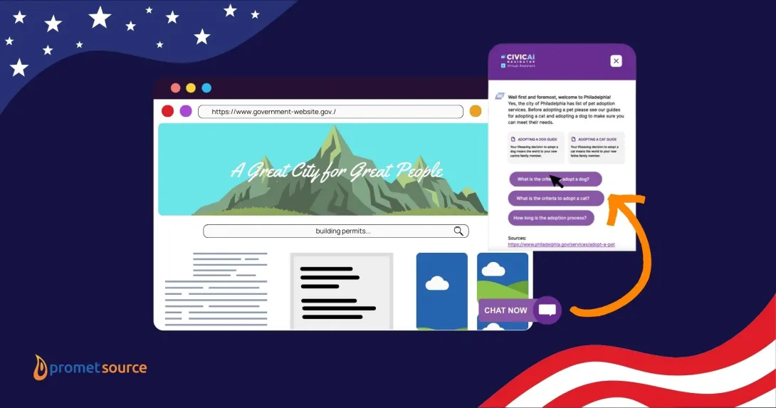
Whether searching for information about trash pickup schedules, looking into the city’s permitting process, learning about local government initiatives, paying bills, or a myriad of other tasks, expectations are high among all visitors that the site needs to work for them. The optimal UX on a government website offers immediate access to the most frequently sought topics, with robust search capabilities that easily lead to everything else.
Beyond information gathering and essential task-related factors, the site needs to reflect the county or municipality its very best light, for both citizens and potential tourists. Just as citizens have high expectations that the grounds and interior of their city hall, county courthouse, or state capital will be well tended and impressive, expectations are high for a modern, easy to navigate, beautifully designed website that reinforces civic pride.
4. The need to offload a wide range of administrative tasks is paramount.
If there is one, overarching truth among all government entities in the current climate it's this: budgets are tight and everyone needs to find ways to do more with less. Multi-tasking websites are stepping in to fill that void, and their success in doing so hinges on the degree to which taking care of tasks online proves to be a value-added process and free of frustration.
5. The content management system needs to enable easy updates along with a high degree of content editing flexibility.
For a public sector website to serve as a single source of truth, site managers and content editors need to be able to make updates on the fly. Weather alerts or public health emergencies can emerge with no warning, and for a government site to be counted on as a provider of up-to-the-minute accuracy, site managers and content editors need to be able to easily make updates or add new pages.
Simple and streamlined content editing capabilities contribute to a consistent and reliable user experience throughout the site and across all desktop and mobile platforms. Another factor fueling the need for simplified and more robust content editing experiences: the opportunity for continuous improvements and citizen-centric enhancements based on community feedback and ongoing intelligence gathering.
Check out the possibilities of Provus -- Promet's new drag-and-drop content editing platform.
The best state and local leaders are well aware that every positive web interaction represents an opportunity to serve citizens and fuel vast new possibilities for connection and operational efficiencies. Partnering with the public sector to create next-level web experiences that address the full spectrum of citizen needs and expectations is what we do here at Promet Source.
Interested in what we can do for you? Let’s talk!
Get our newsletter
Get weekly Drupal and AI technology advancement news, pro tips, ideas, insights, and more.


