Wasatch Front Waste & Recycling District


Client Info
Wasatch is a mountain range in Salt Lake County that encompasses 1,206 square miles of striking landscapes, recreational attractions, and a growing population. Named for the Ute Native American word meaning, “low place in the high mountains,” Salt Lake County residents identify with and take great pride in the unique land formations that surround them.
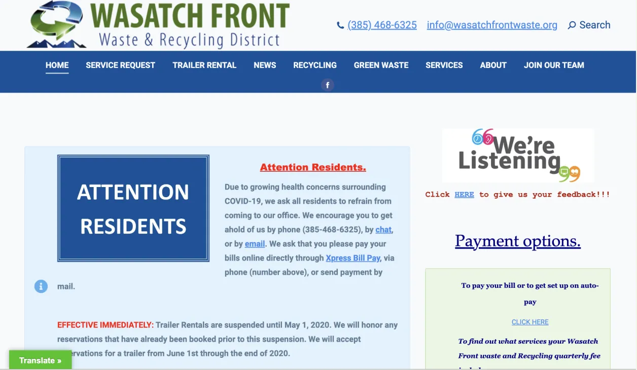
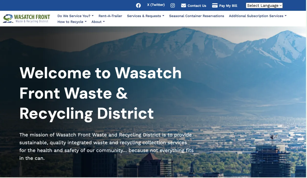
The Wasatch Front Waste & Recycling District’s website needed to reflect appreciation of the region’s striking natural beauty, as conveyed in the mission statement on the home page: “...to provide sustainable, quality, integrated waste and recycling collection services for the health and safety of our community… because not everything fits in the can.”
The website touches close to 90,000 community residents, and expectations are high for a functional website that provides efficient access to needed information.
Industry
Top challenge
Top solution

I love the aesthetics of our new website and how user-friendly it is. One of my favorite parts is the newly created “About Us” page that allows our customers to put a face to the name when they want to reach out.
What We Did
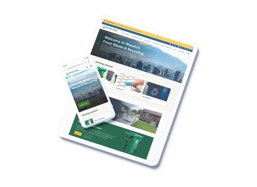
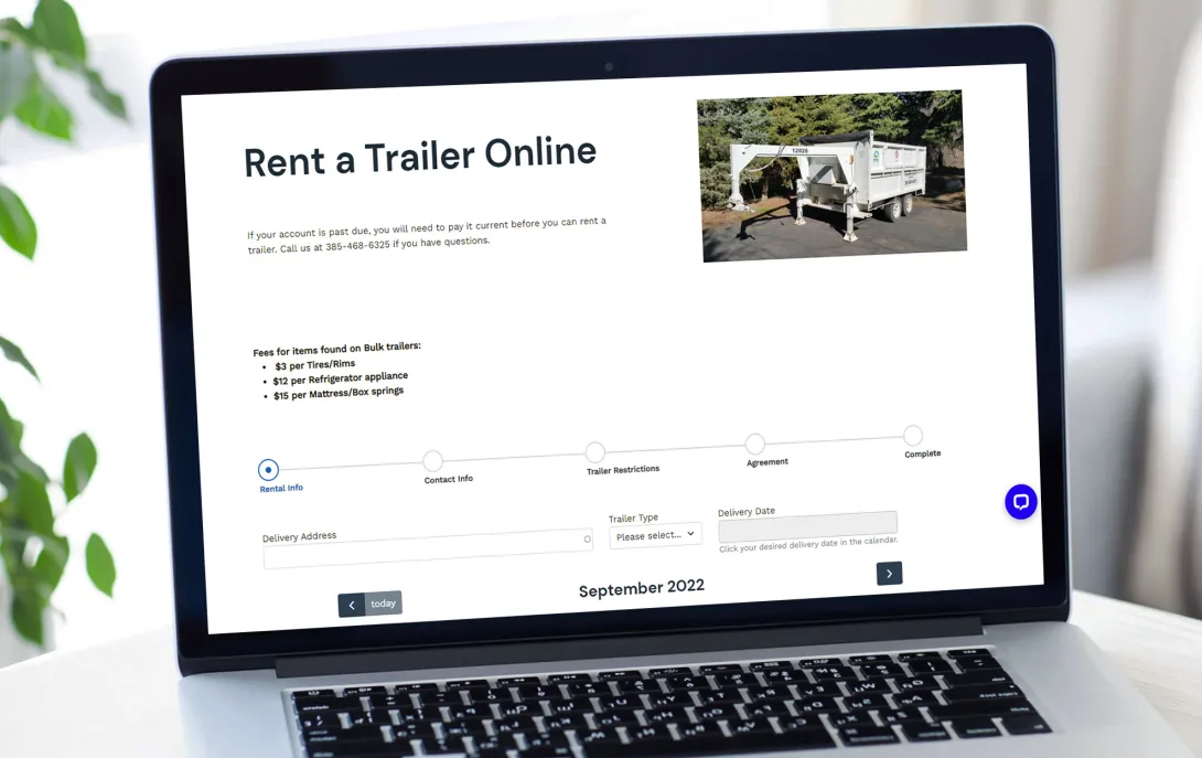
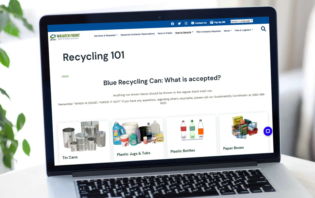
We rebuilt their site on Drupal 9 with our Provus® 2.0 design system, creating an intuitive interface that mirrors the natural beauty of the Wasatch region. The new site features an integrated container reservation system, streamlined content management, and mobile-friendly design that works across all devices.
Simplified Content Management
Staff can now quickly update content and adjust layouts without technical expertise, while maintaining consistent branding. The move from WordPress to Drupal 9 eliminated the previous maintenance headaches.

Smart Scheduling System
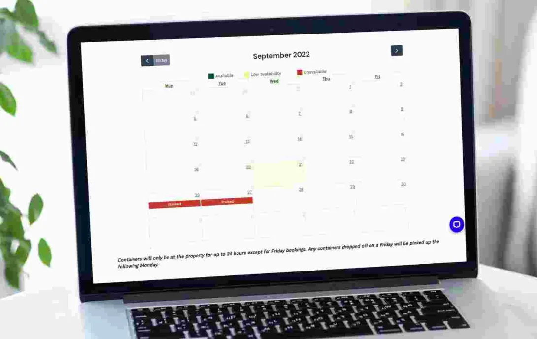
We built a calendar-based container rental program that handles complex booking logic and integrates with online payments. This gives residents 24/7 access to schedule services without calling in.
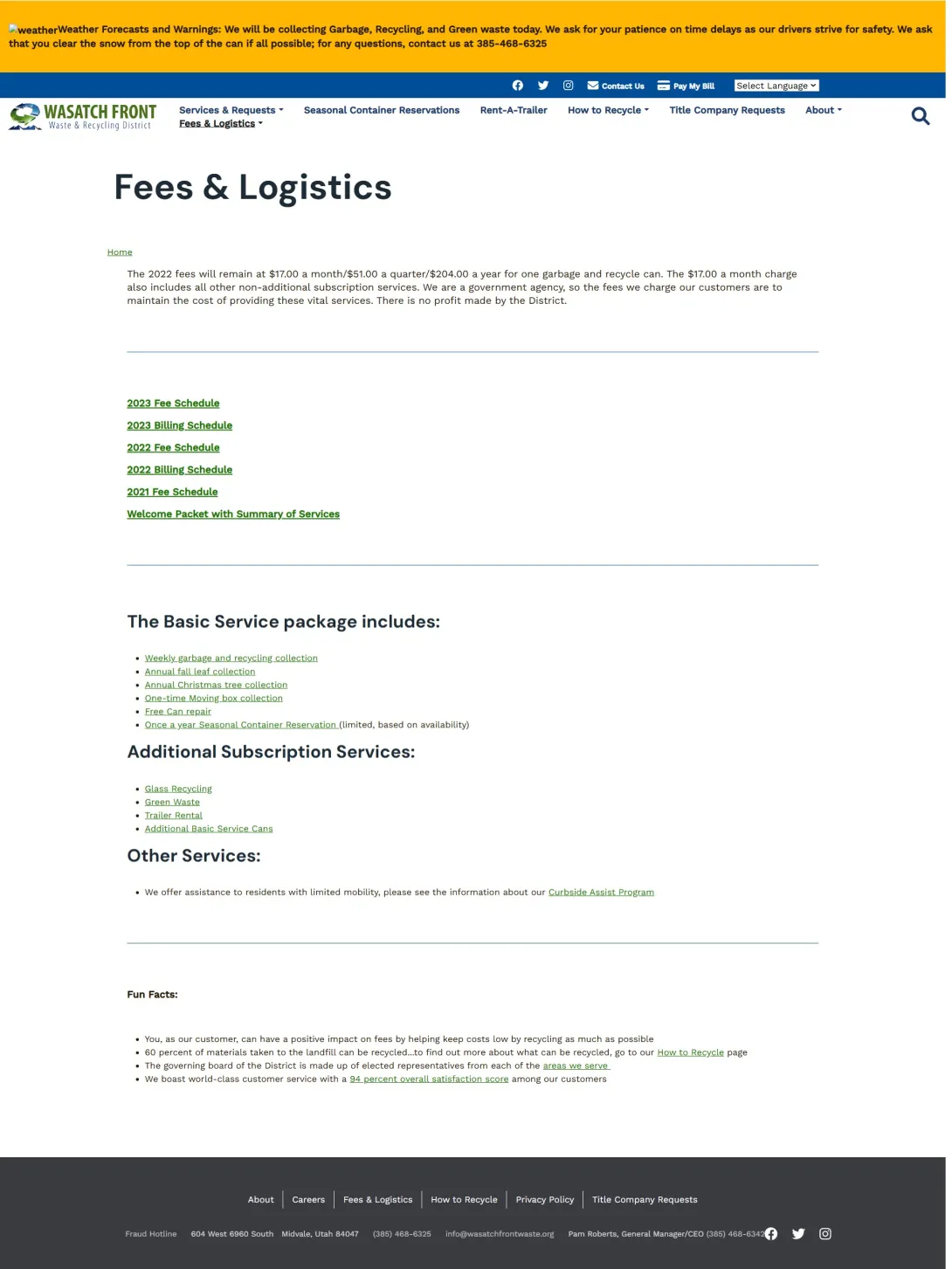
Better Information Architecture
The redesigned navigation and search functionality helps residents quickly find what they need. Content is organized based on how people actually look for information, reducing frustration and phone calls.
The Result
The new site has significantly reduced incoming calls by making it easier for residents to find information and complete tasks online. Staff report major time savings in content management, while residents appreciate the modern, user-friendly interface that works smoothly on any device.
Strategy & Planning
- Discovery workshops
- Information architecture
- User journey mapping
Design & Development
- Provus® 2.0 implementation
- Responsive design
- ADA compliance
Technical Solutions
- CMS migration
- Calendar reservation system
- Payment integration
Training & Support
- Content editor training
- Technical documentation
- Ongoing maintenance
Let’s start your project
Let's discuss how we can help streamline your operations and create an easier experience for both your staff and the community you serve.
Have a project in mind? Fill out the form above, and we'll be in touch to discuss how we can help you succeed.

