Navigating Web Accessibility: Expert Perspectives

In an environment where 25 percent of the population is dealing with at least one disability, and web experiences are the means by which an increasing number of people navigate all aspects of their lives, digital accessibility needs to be a top-of-mind topic.
While there are rules and guidelines governing web accessibility – 67 to be exact in the current Web Content Accessibility Guidelines (WCAG 2.1) – an essential discipline for getting it right incorporates empathetic perspectives concerning the accessibility challenges that people with a wide range of visual, auditory, cognitive, dexterity challenges face.
During a recent Navigating Accessibility webinar collaboration between between DubBot and Promet Source, I had the opportunity, along with Maggie Vaughan, DubBot’s Content Marketing Practitioner, to present essential information concerning web accessibility and cover a range of participant questions.

Key among our takeaways from the event: Web accessibility advocates have broken through. There’s a general acceptance of the fact that web experiences need to be accessible and in compliance with WCAG 2.1. For many, however, questions remain concerning the "how" and in terms of specific guidelines there are questions concerning the “why.”
Here are some of the critical accessibility FAQs that we covered during the webinar.
What’s the connection between headers and accessibility?
WCAG 2.1 sets forth guidelines for how headings should be structured on a web page. The primary reason for this is that screen readers, which are the assistive technology used by visually impaired individuals, rely on the semantic markup of the headings to navigate a page.
In practice, this means that only H3 sub headers can directly follow H2s, and only H4s can directly follow H3s. There can be a series of H3s under an H2, or a series of H4s under an H3, but WCAG does not allow for a jump, for example, from an H2 to an H4.
While heading hierarchies need to follow a sequential downward progression, it is allowable to jump from an H4, for example, back to a primary H2.
Another critical accessibility guideline concerning headers: bold type is never to function as a header.
There are untold ancillary benefits of ensuring web accessibility and it’s important to keep in mind that logical heading hierarchies also improve SEO. Proper semantic markup is an important factor in Google’s algorithm for determining Search Engine Results Page rankings.
Why is descriptive link text an important accessibility factor?
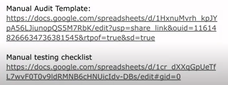
Consider the web experience of a visually impaired person who relies on a screen reader to navigate a website and encounters a link such as one of the following:

The screen reader would audibly state every character in the string: H, T, T, P, S, colon, backslash, backslash, D, O, C, S, and so on. In the case of Google docs, extraordinarily lengthy links contribute to a cumbersome and confusing web experience with a screen reader.
Embedding the links into descriptive text, as we’ve done below, leads to a better experience for all users, and especially those who rely on a screen reader.
DIY WCAG 2.1 Level AA Manual Audit Template
Beginner's Guide to Accessibility Testing and WCAG
Screen readers will indicate “link” to the user prior to reading the text.
For accessibility, as well as usability, there needs to be a visual indicator that the text is a clickable link. The standard is an underlined blue font.
The above two links are excellent web accessibility resources. Download them both for reference!
What constitutes adequate alt text?
Drupal, and most other CMSs, require alt text to be added before uploading images. Nevertheless, it can be tempting to race through this step with some quickly cobbled together wording.
Our best advise for ensuring that alt text is adequate: exercise empathy for the visually impaired site visitor whose only awareness of an image is what the screen reader describes. Focus on a description that will help to build an equal experience for all users.
As with so many elements of web accessibility, compliance contributes to an elevated user experience for all, and that can certainly be the case with alt text.
If for some reason, the link to an image gets broken, the alt text will still appear when the page renders, in which case alt text provides a benefit to both sighted and unsighted users.
It’s also important to keep in mind that search engines look at alt text when crawling a site. As such, and alt text can be an important factor in how Google ranks a page.
How is accessible color contrast determined?
Color contrast is another factor that spans the spectrum which includes usability for all and accessibility for those who are affected with color blindness and a range of other visual impairments. There are many web color contrast checkers available, and the basic contrast requirement is a ratio 4:5:1 ratio for text and 3:1 ratio for images.

Download Promet's checklist for accessible web design.
What are accessible fonts?
Even though WCAG does not provide a list of accessible fonts, a general rule in order to optimize legibility is a minimum text size of 12 points. Generally speaking, widely available fonts such as the following are recommended:
- Tahoma
- Calibri
- Helvetica
- Arial
- Verdana
- Times New Roman
Choosing of commonly used fonts also guards against browsers selecting a default option if a site’s selected font is not available.
Even though there is some disagreement on the topic, sans-serif fonts tend to be considered more readable and accessible than serif fonts – largely due to the fact that they are simpler and more block like.

What’s the best time to test a website for accessibility?
Baking accessibility into web design and development is a far more efficient approach than remediating a site after it launches. We also recommend a regularly scheduled testing cadence, as well as after every major update.
What's the better option for accessibility testing: manual or automated?
Both manual and automated accessibility testing are recommended, as both have their advantages and are designed to catch types of errors that the other is likely to miss.
Automated testing is conducted by software designed to scan a website for purposes of detecting accessibility violations and measuring it against WCAG compliance. There are multiple options for automated web accessibility testing, and key among its advantages is the fact that it expedites the accessibility audit process. Automated testing also makes it very easy to repeat tasks in different sections of a website within a scheduled cadence.
Automated testing has its limitations, though.
- It will not detect every possible accessibility violation.
- It does not duplicate human interactions or how disabled individuals who rely on assistive devices actually navigate a website.
- It does not reveal whether a site is fully keyboard accessible.
- Passing an automated test does not guarantee compliance with web accessibility guidelines
How can tables be made accessible?
The most important factor to keep in mind concerning tables is that header rows needs to be marked as a headers so that the screen reader can identify them as such each time the column is read.
It’s also important to avoid merged cells, which can confuse screen readers.
Nested tables, of course, are a total DON’T for accessibility.

Should links open in a new tab?
This is a largely debated topic, and I think that the best practice is to open a link in a new tab, especially if opening in a current tab interrupts the process.
When links are programmed to open in a new tab, make sure than there is an alert with a title tag microcopy, to ensure the screen reader announces it to the user.
What is the best practice for making phone numbers accessible?
We recommend prefacing phone numbers with TEL: so that users on mobile can just tap the number to connect.
What is the best way to deal with PDF files that are not accessible?
PDFs need to be made accessible. If the source document cannot be remediated in semantic HTML, with proper heading structures and alt text, as needed, consider eliminating the document or conveying the information in another way.
There is more at stake than accessibility for visually impaired users. Failure to remediate a site as needed exposes you to potential lawsuits.
Ensuring accessible web experiences is often a legal requirement, along with an important step to avoid both litigation and public relations challenges. And it is always the right thing to do.
Promet’s collaboration with DubBot on this recent webinar was a fabulous experience, helping us to see that there is always more to learn, and that there is great power in partnerships.
Download a recording of the the Navigating Web Accessibility webinar
Have a question that wasn’t covered here? Want to ensure that your site is up to speed on current ADA accessibility guidelines? Let’s talk!
Get our newsletter
Get weekly Drupal and AI technology advancement news, pro tips, ideas, insights, and more.


